Documentation Index
Fetch the complete documentation index at: https://docs.truestate.io/llms.txt
Use this file to discover all available pages before exploring further.
Dashboards are interactive, visual canvases that let you explore and monitor your data in real time without writing code. In TrueState, a dashboard is built by connecting one or more data sources—each defined by a SQL query and optional filters—to a collection of visual components like tables, bar charts, line graphs, pie charts or scatter plots. You can arrange these visuals on a flexible grid, apply and save filters, and even enable embedding search on datasets with vector embeddings. Dashboards make it easy for business and technical users alike to drill down, spot trends, compare metrics across categories or time, and share insights across your organisation—all within a no-code, self-service interface.
Dashboard AI Assistance
The TrueState AI Assistant is able to create and modify Dashboards. This is the preferred way to get started with a Dashboard. Describe what you want the Dashboard to do, and the bot will create it for you.
A Dashboard must be added to the chat context for the bot to be able to modify it. Click the + icon above the chat and select the Dashboard to add it to the context.
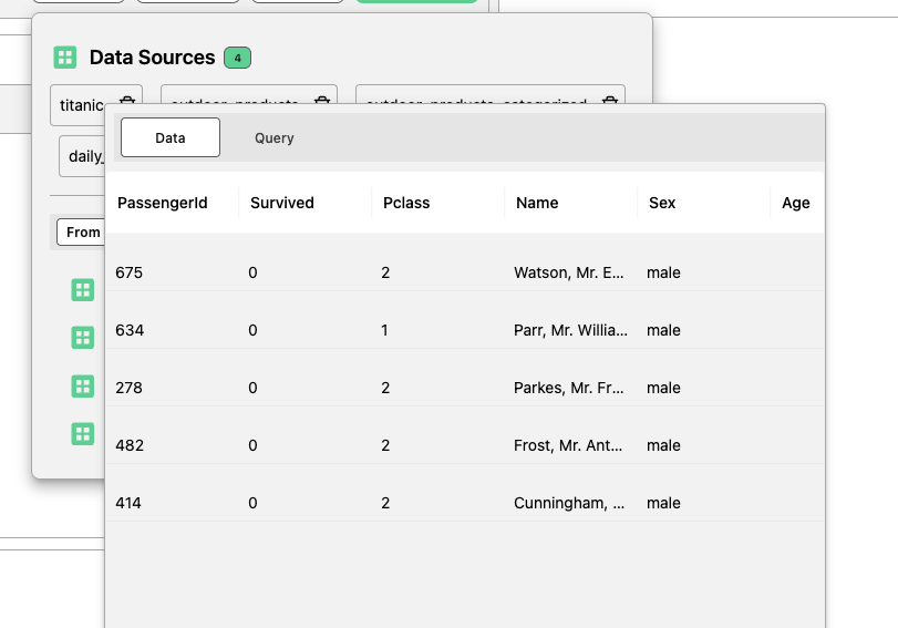
Data Sources
A data source is the source of the data which will be displayed on the dashboard. You can select a dataset to use as a data source, or write a custom SQL query—the query result will act as the data source. Dashboards can include multiple data sources at the same time. Data sources must be defined before adding and configuring visualisations.
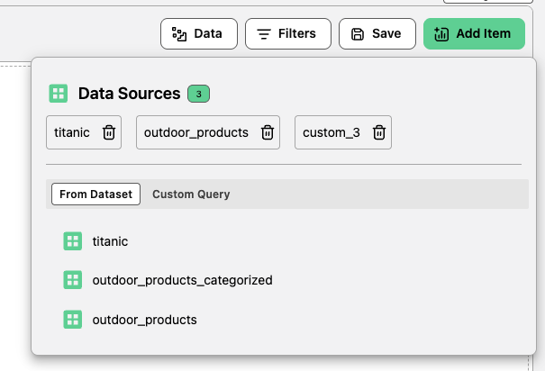 You can hover over the Data Source to see previews or query against the dataset
Dashboard Canvas
The Dashboard Canvas consists of a set of interactive visual displays of the data. These displays can be added, removed, resized and filtered. The below documentation outlines each type of visualisation, and documents the configuration settings.
Adding, Editing or Removing a Visual Item
To add a Visual Item, use the button in the top right of the screen.
| Action | Description |
|---|
| Add | Click Add Item to insert a new visualisation item into the Dashboard Canvas. |
| Edit/Delete | When you hover over the visual item’s header, the Edit and Delete buttons will appear on the top right of the item. |
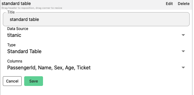
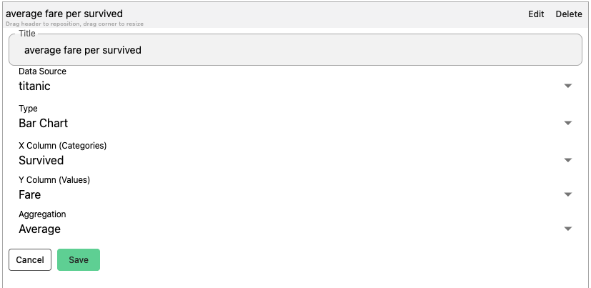
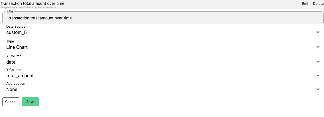
Visualisation Item Settings
Each visualisation item requires a title and a source of the data.
| Setting | Description |
|---|
| Title | The display name of the visualisation item. |
| Data Source | The data the visualisation will be based on. |
| Type | The kind of visualisation (e.g., Standard Table, Chart, etc.). Depending on the selected Type, different configuration options will be available (e.g., selecting columns for a table). |
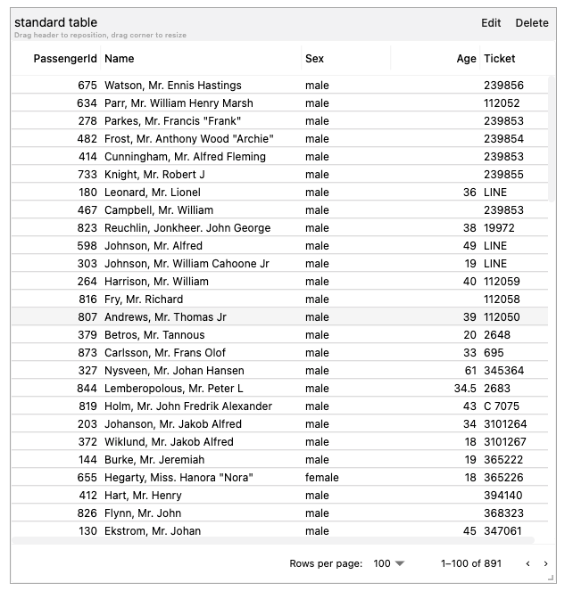
Standard Table
The only configurable field on a standard table is to set the columns which will be shown.
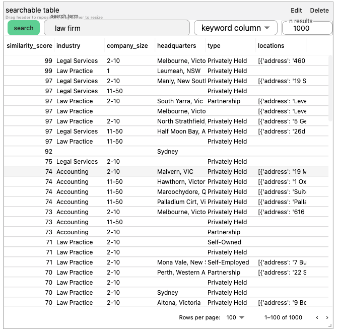
Searchable Table
If a column in the dataset has been made searchable (check the section Pipelines -> Make Searchable), the search field will be automatically shown in the standard table.
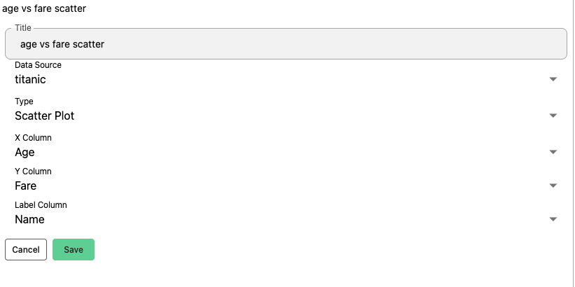
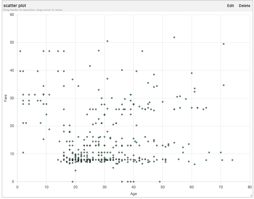
Scatter Plot
| Property | Requirement |
|---|
| X Column | has to be numeric |
| Y Column | has to be numeric |
| Label Column | shows up as tooltip when you hover over the dot in the chart |
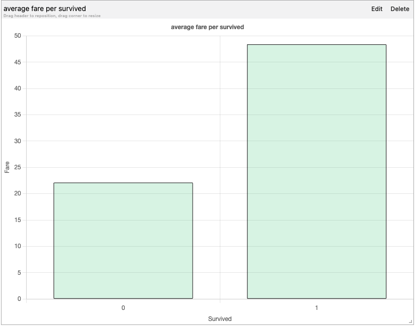
Bar Chart
| Property | Requirement |
|---|
| X Column | needs to be categorical |
| Y Column | needs to be numeric. |
| Aggregation | (sum, average, max etc.) can be applied on the Y Column. |
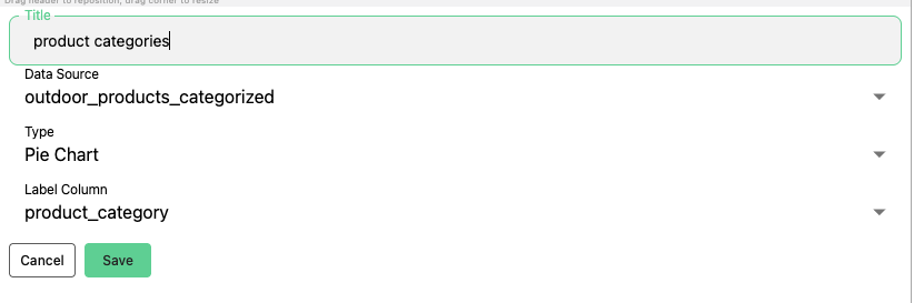
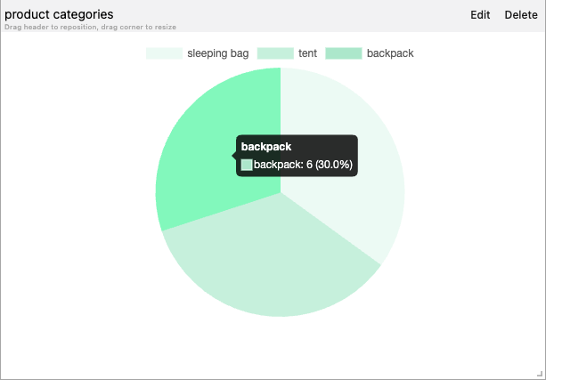
Pie Chart
The Pie Chart illustrates numerical proportions, with each slice of the pie representing a category. If there are too many categories, a bar char will be more appropriate.
| Property | Requirement |
|---|
| Label Column | the categories in the column that show up in the Pie chart. |
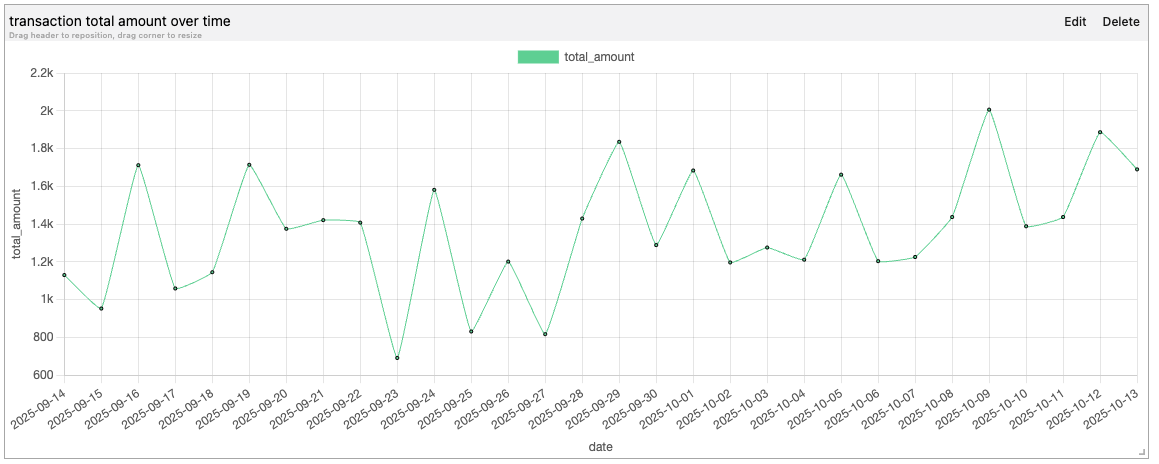
Line Chart
The Line chart shows trends over time or continuous data.
| Property | Requirement |
|---|
| X Column | usually represents date or time |
| Y Column | represents the measured values. |
| Aggregation | can be applied on the Y Column. |
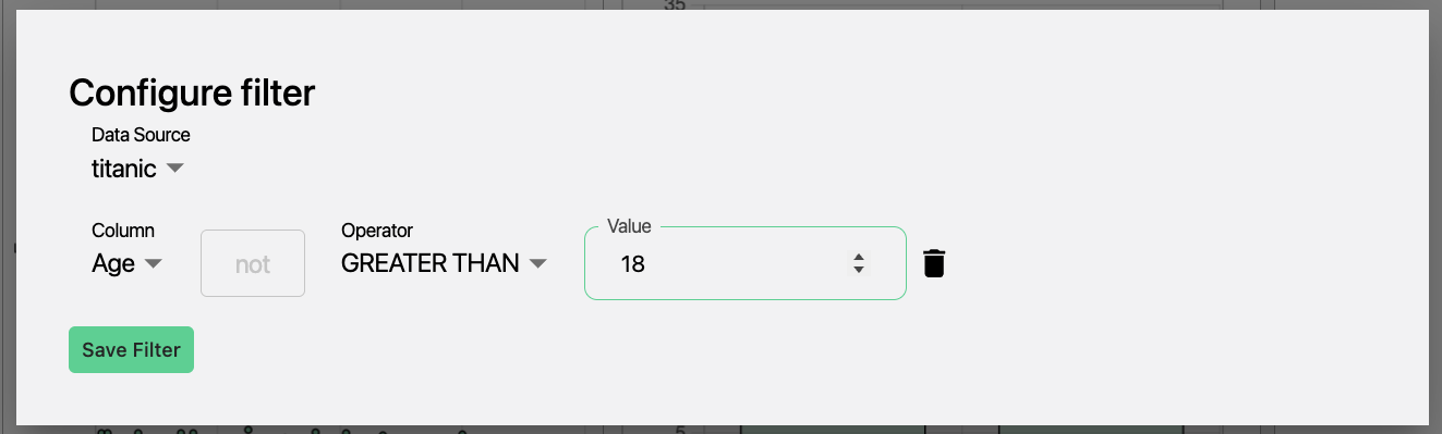
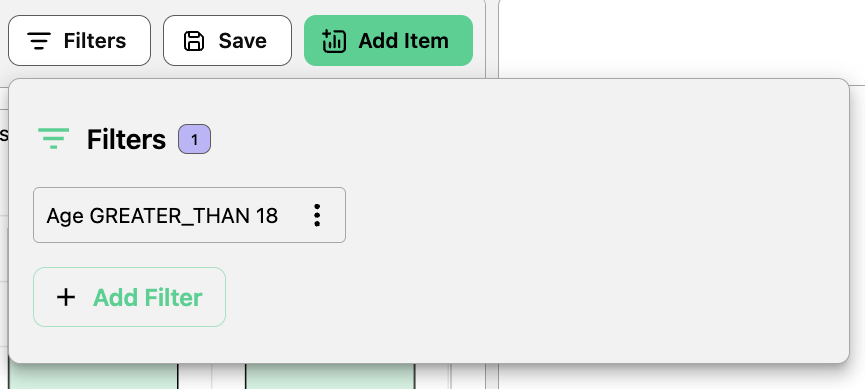
Filters
Filters are applied globally to all Visual Items in the Dashboard. These can be set to display a subset of the original data